Still on Bartender 4: what works and what to do next
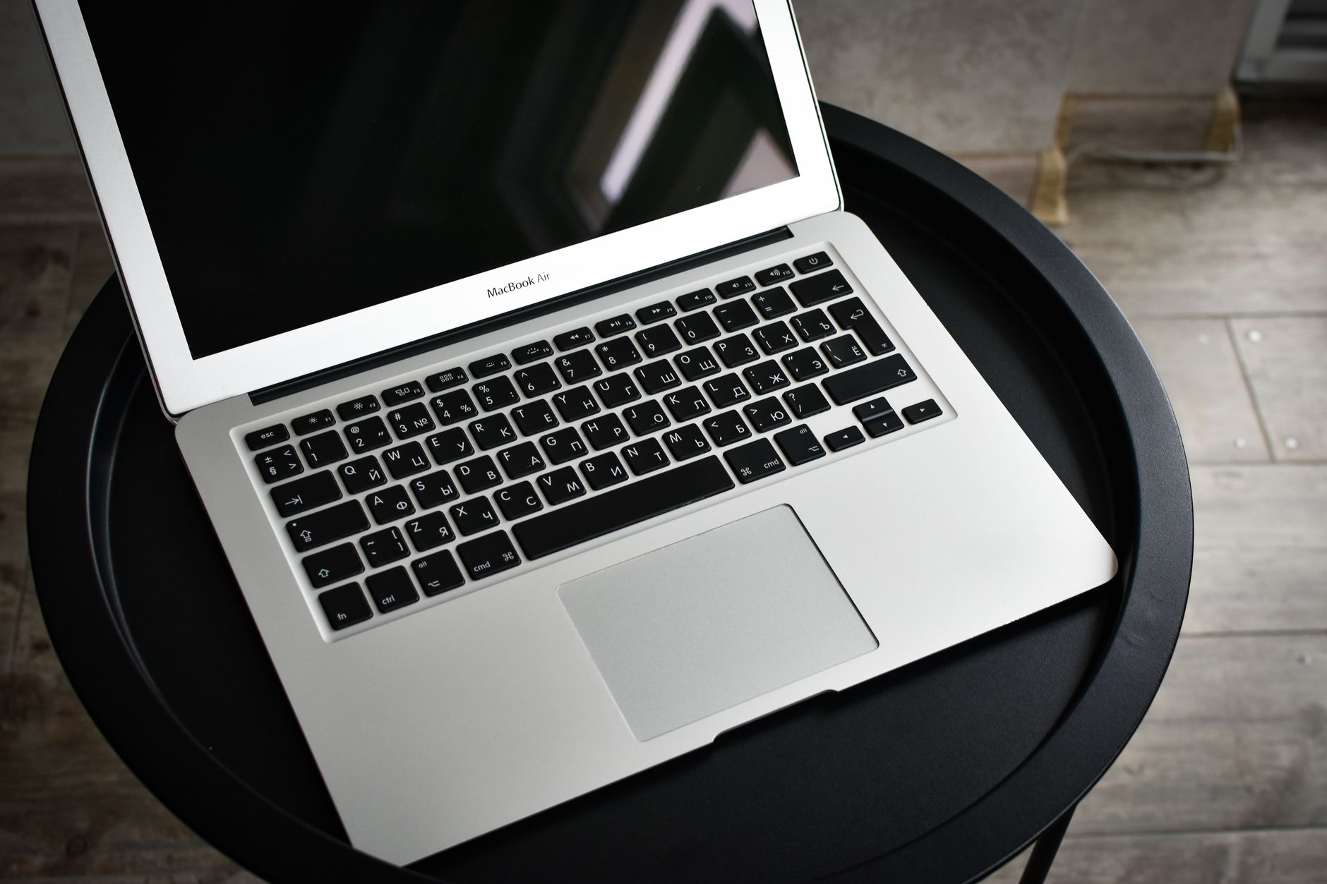
The menu bar still collapses when the pointer reaches the top. Hidden icons still come back on a click. Nothing is visibly broken, and that is exactly what makes the question hard to settle. A Mac running Bartender 4 today is running software written for a macOS that shipped several major releases ago, sitting on top of a menu bar Apple has since rebuilt more than once.
The useful question is not whether the app still launches. It is which parts of it are doing work that the operating system no longer does on its own, and which parts are quietly resting on behavior Apple has already changed. Below is the version ladder as the publisher currently documents it, the features that are genuinely still load bearing, the permission prompt that keeps coming back, and three honest ways forward. No upgrade is treated as automatic.
The version ladder, as currently documented
The publisher keeps a separate support entry for each generation, and the split there is the clearest statement of what each release targets. Checked on macbartender.com on 2026-09-18:
| Version | Listed target |
|---|---|
| Bartender 4 | macOS Big Sur and Monterey |
| Bartender 5 | macOS Sequoia and Sonoma |
| Bartender 6 | macOS 26 Tahoe |
| Bartender 7 | macOS 27 |
The product page for the fourth generation is slightly more generous than the support index. It reads:
Bartender 4 is designed for all the great changes in macOS with Big Sur, Monterey, Ventura and newer. Source: macbartender.com
Both statements can be true at once. "Designed for" describes intent at the time of writing. The support index describes where the publisher will still help. A Mac on Ventura is inside the first statement and outside the second, which is a reasonable summary of what running an old menu bar tool actually feels like: it works, and nobody is testing it any more.
Worth noting for anyone holding a license: the current FAQ says that a key is not locked to a single generation.
Bartender 7 is built for macOS 27. For macOS 26, grab the latest copy of Bartender 6 (your license key works on 6 too). Source: macbartender.com
That matters when the reason for staying on an old version is a fear of paying twice. It may not be the reason at all.
What the fourth generation actually gave you
Reading the old feature page after several years is a useful exercise, because a lot of what felt novel then is simply how menu bar tools work now. The documented list covers Quick Reveal, which brings hidden items back by moving the pointer into the menu bar or by clicking it. The Bartender Bar, which puts hidden items in a second strip below the menu bar instead of expanding the bar itself. Menu bar item spacing, which tightens the gap between icons so more of them fit. Quick Search, which finds and activates an item from the keyboard. Hotkeys for individual items. And triggers, which show an item only under a condition: on battery power, off Wi-Fi, or while Time Machine is backing up.
Read that list against daily use and it separates cleanly. Two capabilities get exercised constantly: hiding things, and getting back to a hidden thing without breaking concentration. Everything else is configured once and then forgotten. Spacing is a setting, not an action. Triggers either fire silently or were never set up. That split is the whole basis for deciding what to do next, and it is worth checking against real behavior rather than memory. Spend a week marking which features actually get operated. The result is usually smaller than expected, and it decides how much a newer version or a different tool has to match.
The part that has aged
Item spacing is the clearest example of a feature whose value moved. It existed because macOS gave menu bar items a fixed and fairly wide gap, and on a laptop screen that gap was the difference between fitting a tool and losing it. Notch hardware changed the arithmetic, and later macOS releases changed the drawing of the bar again. Spacing still helps, but it is no longer the headline.
The Screen Recording prompt
Anyone running an older menu bar manager on a current macOS has seen the permission request. It is not malware behavior and it is not optional in the old architecture. To know which icons are present and where they sit, the app reads the pixels of the menu bar, and macOS classifies reading the contents of the screen as Screen Recording, regardless of whether anything is recorded.
The consequence is a recurring prompt. macOS re-asks for Screen Recording periodically, and it re-asks after updates. On a machine that has been carrying the same configuration for years, that prompt is often the single most irritating thing about the setup.
This is one place where the newer generation genuinely changed rather than merely added. The current version is documented as able to run without Screen Recording permission at all, falling back to drawing app icons rather than captured images of the bar items. A tool that does not need to read the screen does not need to ask. If the recurring prompt is the actual complaint, that is the specific thing to look for in any replacement, and it is worth checking on the features page of whatever gets shortlisted rather than assuming.
What changed in the menu bar itself
Two shifts are worth naming, because they are the reason an old tool can feel subtly wrong even when it runs.
The first is hardware. Laptops with a camera housing in the middle of the menu bar do not simply overlap icons any more. Since macOS 12.1 the system stops laying items out before the housing, which means that on a full bar, items past the limit are not hidden behind the notch. They are not placed at all. A tool designed before that behavior existed is solving a problem that has changed shape.
The second is drawing. The menu bar in recent macOS releases is rendered with a translucent treatment and no solid background by default, and the look is controlled by settings the tool does not own. Anything that paints a custom bar, tints it, or draws a second strip underneath is now negotiating with a system that has its own opinion about transparency. Tools written before that negotiation existed can look slightly off, and the fix is usually a system setting rather than an app setting.
Neither of these breaks an old install outright. Both explain why an old install feels less precise than it used to.
Three ways forward
There are only three real options, and the right one depends on which of the two load bearing capabilities is at risk.
| Option | Fits when | The cost |
|---|---|---|
| Stay where you are | The Mac is not moving to a new major macOS, and the permission prompt is tolerable | No support for this generation, and no fixes if a future update changes the bar again |
| Move up the same product line | The setup depends on conditional layouts, profiles, or scripting that few other tools implement | A newer generation, and a decision between one time, yearly, and lifetime pricing |
| Switch tools | The daily need is hiding and reaching, and the rest of the feature list is unused | Rebuilding the layout once, and learning one new gesture |
The middle option deserves a note on how it is priced now, because the shape changed. There are three tiers rather than one: a one time purchase covering a single generation, a yearly tier that includes future major versions, and a lifetime tier. Which one is cheaper over five years depends entirely on how often the machine follows Apple to a new major release, not on the feature list. Check the current figures directly before deciding, because they are localized and they move.
The third option is the one most people underrate, and the reason is the week long test described earlier. If the marked list after seven days contains only hiding and reaching, then most of what a large menu bar suite offers is being paid for and not used. Comparing what a smaller tool covers against that short list is a faster decision than comparing full feature matrices, and a side by side comparison is only useful once the short list exists.
What the replacement has to get right
Two behaviors are worth defending regardless of which product wins.
The first is that hidden must not mean unreachable. An icon that has been tucked away still needs to be clickable, and its menu still needs to open where the eye expects it. A tool that hides an icon but forces the bar to expand before anything can be pressed has traded one interruption for another. This is the single most common difference between products that look identical on a feature list.
The second is that the bar must stay predictable. Items should not reorder themselves because an app restarted. A layout built on Monday should be the same layout on Friday. Predictability is hard to demonstrate in a screenshot and it is the thing most likely to be missed while evaluating on day one, which is why a trial period should span a normal working week rather than an afternoon.
Anything beyond those two is preference. Tinting, rounded bars, profiles tied to displays, and scripted actions are all real features, and none of them will be missed by someone who never turned them on.
What does not carry over
One expectation is worth lowering before any move. Menu bar layouts do not transfer between products. There is no export format, no shared standard, and no import path from one publisher to another. Whatever the destination is, the ordering, the hidden list, and the hotkeys get rebuilt by hand.
That rebuild is smaller than it sounds, and it is usually a benefit. A bar that accumulated over three or four years contains icons belonging to apps that are no longer installed, tools that were tried once, and duplicates from an app that now ships two separate indicators. Rebuilding from an empty list surfaces all of it. The honest budget is twenty minutes, most of it spent deciding what deserves to be visible at all rather than fighting the software.
The one thing that does carry over is the habit. Whichever gesture reveals the hidden items, whether that is a hover, a click, or a hotkey, it takes a day or two before the hand stops reaching for the old one. Judging a replacement before that adjustment finishes produces a verdict about muscle memory rather than about the tool.
What to change first
Run the seven day test before changing anything, because it costs nothing and it decides everything. If the marked list is only hiding and reaching, a smaller tool is enough, and the fastest way to find out is to download one and rebuild the layout once. If the list includes conditional layouts that actually fire, stay inside the product line that implements them. Either way, start by checking whether the recurring Screen Recording prompt is the real complaint, because that alone rules out a whole category of older designs, and Koffret is one of the options worth testing against that specific requirement.
Frequently asked questions
Is Bartender 4 still safe to run on a current macOS?
It runs, and it is still the publisher's own software, but the support index lists it for macOS Big Sur and Monterey only. That means no fixes for this generation if a future macOS update changes how the menu bar is drawn. The practical risk is not security, it is being stranded after an update.
Does a Bartender 4 license work on the newer versions?
Not automatically across every generation, but license keys are not as locked as people assume. The current FAQ states that a key works on both of the two most recent generations, and the site advertises a discounted upgrade path for existing owners. Check the upgrade page with the original purchase email in hand before buying anything new.
Why does macOS keep asking for Screen Recording permission?
Older menu bar managers read the pixels of the menu bar to know which icons are there and where they sit, and macOS treats reading the screen as Screen Recording even when nothing is recorded. The prompt reappears after updates by design. Newer designs that identify items without reading the screen do not need the permission at all.
Will the icons hidden behind the MacBook notch come back if the tool is upgraded?
Partly. Since macOS 12.1 the system stops placing items before the camera housing rather than putting them underneath it, so items past the limit are missing rather than covered. A menu bar tool helps by reducing how many items compete for that space, not by reclaiming the housing area itself.
Is it worth paying for a menu bar tool at all now that macOS has Control Center?
Control Center absorbs the system icons, which frees space, and for a short bar that may be enough. It does not manage third party icons, which is where a full bar usually comes from. The test is simple: move every system icon into Control Center first, and see whether the remaining bar still overflows.