Hide the battery percentage in the Mac menu bar
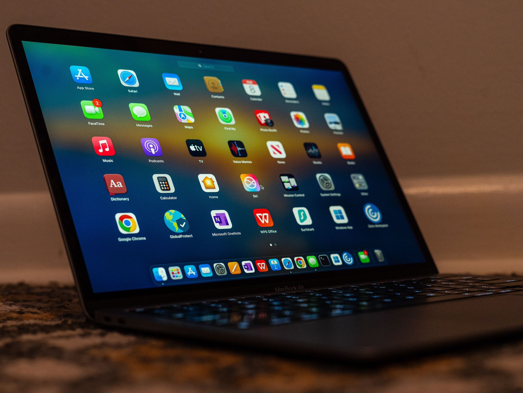
The battery percentage is two characters wide, and on a crowded menu bar those two characters are competing with a dozen third party icons for the same strip of pixels. Turning the number off is a single toggle. Deciding whether it should be off is the part worth thinking about, because the same strip of screen also has to hold everything else that wants to live there.
This walks through where the setting is in each macOS version, what disappears when you hide the battery item completely rather than just the number, and how to decide what to cut when the percentage is the thing you actually want to keep.
Two separate settings, often confused
macOS treats the battery indicator as two independent switches, and searching for the wrong one is the usual reason people cannot find it.
The first switch controls whether the battery item appears in the menu bar at all. Turn it off and the icon is gone from the right hand strip. The second switch controls whether the numeric percentage is drawn inside or beside the icon. Turn that off and the icon shape stays, showing charge level as a fill, but the digits disappear.
Most people searching for how to hide the battery percentage want the second switch. They still want to glance up and see whether the machine is plugged in. They just do not want the number taking horizontal space next to the clock. A smaller group wants the first switch, because they work plugged in at a desk and the battery indicator is pure decoration.
Both switches live in the same place. Knowing which one you want before you open the settings pane saves a round trip.
Where the setting lives, by macOS version
Apple has moved this control twice in five years, which is why step by step instructions found online often do not match what is on screen. Check your version first from the Apple menu, under About This Mac.
| macOS version | Where to go | What to toggle |
|---|---|---|
| macOS 13 Ventura and later | System Settings, then Control Center | Battery, then Show Percentage |
| macOS 11 Big Sur and macOS 12 Monterey | System Preferences, then Dock & Menu Bar | Battery, then Show Percentage |
| macOS 10.15 Catalina and earlier | System Preferences, then Energy Saver, or the battery menu itself | Show Percentage |
On macOS 13 Ventura and later, open System Settings, select Control Center in the sidebar, and scroll the right hand pane until you reach the Battery group. Show in Menu Bar and Show Percentage sit next to each other. Flip Show Percentage off and the change takes effect immediately, with no restart and no logout.
On macOS 11 Big Sur, the whole concept changed. Control Center arrived on the Mac, and menu bar visibility for system items was consolidated into a single Dock & Menu Bar preference pane. Battery percentage stopped being a battery setting and became a menu bar setting. That reassignment is the origin of most of the confusion, because older guides still point at Energy Saver.
On Catalina and earlier, the percentage toggle was reachable by clicking the battery icon in the menu bar and choosing the option from the menu that dropped down.
If the Battery group does not appear in the settings pane at all, the Mac has no internal battery. Desktop models show the group only when an uninterruptible power supply is connected. Nothing is broken.
What disappears if you hide the icon entirely
Turning off Show in Menu Bar removes the battery item from the right hand strip completely. The information does not become unreachable, but the path to it gets longer.
Charge level, charging state, and the Low Power Mode switch all remain inside Control Center. Click the Control Center icon in the menu bar and the battery row is there. That is one extra click compared to reading the number directly off the menu bar.
The list of apps using significant energy is the piece most likely to be missed. It appeared in the battery menu when you clicked the icon. With the icon hidden, the equivalent information lives in System Settings under Battery, where macOS 13 Ventura and later show usage graphs for the last 24 hours and the last 10 days. That is a fine place to review a pattern and a poor place to catch a runaway process in the moment.
There is also the question of the charging indicator itself. The icon changes appearance when power is connected, which is how most people confirm that a cable is actually delivering charge rather than sitting loose in the port. With the icon hidden, that confirmation moves into Control Center too. On a desk with a single reliable charger this rarely matters. On a machine that gets moved between a dock, a travel charger, and a display that supplies power over one cable, it matters more, because a cable that looks connected and is not is a common enough annoyance to be worth one glance.
So the honest trade is this. Hiding the icon entirely costs you an at a glance check on charging state and a fast path to the energy list. If you work plugged in and only unplug for meetings, that cost is close to zero. If you spend the day on battery and watch the number drop, keep the icon and cut something else.
Keeping the percentage and cutting elsewhere
If the number stays, the menu bar has to give up space somewhere else. Sorting by two questions makes that decision fast.
The first question is whether you click the item or only look at it. Clipboard history, screenshot helpers, VPN switches, and audio device pickers are things you click. They earn their position. The clock, the battery, the Wi-Fi signal strength, and the Bluetooth state are things you look at. Anything you only look at can usually move into Control Center without changing how you work, because Control Center already carries a copy of it.
The second question is how many times a day you actually need it. An app you touch once a week does not deserve permanent residency next to the clock.
Work through the removals in this order:
- Start with icons the app itself can hide. Cloud storage clients, developer tools, chat apps, and note taking apps very often have a setting like Show icon in menu bar buried in their preferences. Removing one of these costs nothing and frees real space.
- Move to system items next. Wi-Fi, Bluetooth, Spotlight, Time Machine, and the battery are all controlled from the same Control Center pane you just used for the percentage.
- Only then consider a menu bar manager for whatever refuses to go away.
Doing it in that order matters. People often install a manager first and end up hiding icons that could simply have been turned off, which leaves the hidden area as cluttered as the visible one used to be.
One more thing helps before any of this: rearranging what remains. Hold Command and drag a menu bar item sideways, and it moves. Grouping the items you click on one side and the items you only read on the other makes the bar easier to scan even when the total count has not changed. Not every third party icon supports the drag, but system items generally do, and it costs nothing to try.
It is also worth deciding what happens when an item is only relevant some of the time. A VPN switch matters on a hotel network and not at a desk. A screen recording control matters during a meeting and not afterwards. Rather than deleting these outright, many people keep them in a collapsed group they can open on demand, which is exactly the job a menu bar manager exists to do.
Why items vanish on a MacBook with a notch
The 14 inch and 16 inch MacBook Pro, and the MacBook Air from 2022 onward, place the camera in a notch that splits the menu bar in two. The area behind the notch is unusable.
App menus on the left take priority. When you switch to an application with a long menu structure, the left side expands and the rightmost strip loses room. macOS drops menu bar items starting with the ones furthest from the right edge, which means your third party icons disappear before the clock does. Switch back to Finder and they reappear.
This is not a bug and there is no setting that fixes it. The two real remedies are reducing how many items compete for the space, or using a tool that decides which items stay visible instead of letting macOS truncate arbitrarily. Plugging into an external display makes the symptom vanish, which is why it often seems intermittent.
There is a related setting worth knowing about, even though it does not solve crowding. In System Settings under Control Center, near the bottom, macOS offers Automatically hide and show the menu bar with four choices: always, on desktop only, in full screen only, and never. That hides the entire bar, including the items you wanted to see. It is a screen space setting, not an organisation setting.
When a menu bar manager earns a place
After the app level and system level cleanup, some people still have more icons than space. That is the point where a dedicated tool is reasonable rather than premature.
A few things separate these tools from each other, and they are worth checking before installing anything.
The most important one is what happens to a hidden icon when you need it. Some tools simply push icons off screen, so using a hidden item means expanding the bar, finding the icon, and clicking it. Others let you reach a hidden item while the bar is still collapsed. That difference decides whether hiding an icon costs you three actions or one, every single time you use it. The features page lists what a given tool can do with hidden items, which is the fastest way to check.
Permissions come second. Managing menu bar items can require accessibility or screen recording access depending on the approach the developer took. Look for a clear explanation of which permission enables which capability, and whether the tool is usable without granting all of them.
Cost model and macOS support come third. Some tools are one time purchases, some are subscriptions, and some are free with a narrower feature set. Support for the current macOS release matters more here than in most software categories, because Apple changes menu bar behaviour between major versions and a tool that has not been updated can break at upgrade time. A side by side view of the options is on the comparison page, and the pricing page states what each tier includes.
What to change first
Open System Settings, go to Control Center, find Battery, and turn off Show Percentage while leaving Show in Menu Bar on. Live with that for a few days before touching anything else, because it is the change with the smallest cost and it frees space immediately.
If the bar is still crowded after that, go through your running apps and turn off every menu bar icon the app itself can hide. Only after both of those steps is it worth adding a tool like Koffret to manage what remains.
Frequently asked questions
Can I still see the battery level after hiding the percentage?
Yes. Hiding the percentage removes only the digits. The icon still shows charge level as a fill and still changes appearance when the Mac is plugged in. If you hide the icon as well, the battery row inside Control Center shows the exact percentage.
Why is there no Battery section in my Control Center settings?
The Mac has no internal battery. Desktop models only show the Battery group when an uninterruptible power supply is connected over USB. On a laptop, try typing battery into the search field at the top of System Settings to jump straight to the pane.
Does turning off the percentage save battery life?
No. The percentage is text drawn in the menu bar and the power cost of rendering it is not measurable in normal use. Turn it off for screen space and for a less busy menu bar, not for runtime.
My menu bar icons keep disappearing and coming back. Is that related?
That is a separate issue caused by running out of horizontal room. Applications with long menus push the right hand items out, and MacBooks with a notch have less usable width to begin with. Reducing the number of items, or using a menu bar manager to control which ones stay visible, is what stops it.