Change the size of the Mac menu bar text and icons
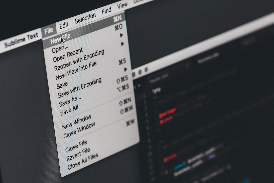
The clock at the top right of a MacBook screen is small. On a 13 inch display at default scaling it is genuinely hard to read at arm's length, and the status icons beside it are smaller still. Leaning forward a dozen times an hour to check whether the Wi-Fi symbol has changed shape is not a workflow.
macOS has one setting aimed directly at this, two more that hit it as collateral, and a hard limit on what any of them can do to third party icons. The three are often confused with each other, partly because they live in three different panes, and partly because only one of them is actually named after the menu bar.
Three different things get called menu bar size
| What is too small | What controls it | Where |
|---|---|---|
| The clock, the app menus, the menu text | Menu bar size | Accessibility, Display, Text |
| Everything on the screen at once | Resolution | Displays |
| Text inside apps and on the desktop | Text size | Accessibility, Display, Text |
The first row is the one most people want and the hardest to find, because it sits in Accessibility rather than anywhere near the menu bar settings. The second row works but is a much larger change than it first appears. The third row does not affect the menu bar at all, which is the source of a lot of wasted effort.
The control that targets the menu bar
System Settings, Accessibility in the sidebar, Display, then the Text section. Apple's description is one sentence.
Menu bar size: Set the font size in the menu bar to Large, or back to Default. Source: support.apple.com, read September 18, 2026
Two things are worth reading carefully in that sentence. It is a font size, not a general scale, and it has two values rather than a slider. Large is a single step, and there is no way to ask for something between the two or beyond Large.
What actually changes is more than the text. The menu bar becomes taller to accommodate the larger font, and system status icons that draw themselves relative to the bar's thickness grow with it. On a MacBook the extra height comes out of the space available to windows below, which on a laptop screen is a real cost. On an external display it is barely noticeable.
Nothing about this setting requires a restart or a logout. It applies immediately, which makes it easy to try for a day and reverse if the trade turns out to be bad.
Changing the whole screen instead
The other route is to make everything larger by reducing the effective resolution. Apple lists it among the ways to increase the size of what is on screen.
Reduce the resolution to make everything on the screen appear larger. Source: support.apple.com, read September 18, 2026
In System Settings, Displays, the Resolution control offers a row of options running from more space to larger text. Apple describes the control as a way to "choose the amount of detail your display shows," with Default automatically using the best resolution for that display. A Show all resolutions option exposes the rest, including low resolution modes.
This makes the menu bar bigger, and it makes everything else bigger too. That is the whole trade. A 14 inch laptop set one step toward larger text loses a meaningful amount of usable area in every window, and side by side document work becomes cramped. It is the right answer when the screen is uncomfortable in general and the wrong answer when only the menu bar is the problem.
There is a second consequence specific to this topic. Making everything larger also makes every status icon wider, so a menu bar that was already close to full will overflow at the new scale. The setting that was supposed to make icons easier to see can end up hiding several of them.
Why third party icons do not always follow
System icons such as Wi-Fi, Bluetooth and Battery are drawn by macOS and scale with the bar. Icons belonging to installed applications are drawn by those applications, and how they respond depends on how the developer built them.
Apple gives developers two standard lengths for a status item. One is described as "a status item length that is equal to the status bar's thickness," which ties the item to the bar and lets it adapt when the bar changes height. The other "dynamically adjusts to the width of its contents," which is what an item showing a battery percentage or a countdown needs.
An app using a template symbol at the standard length will grow and shrink correctly with the Menu bar size setting. An app drawing a custom view at a fixed pixel size may not, and will look either undersized or slightly wrong in a taller bar. There is no user setting that corrects this. It is a property of the app, and the only routes are the app's own preferences, if it offers an icon style choice, or a report to its developer.
This also means a mixed result is normal rather than a fault. After turning on Large, the system icons look right and one or two third party icons look out of place. Nothing is broken.
Readability is not only a size problem
Before accepting the height cost of Large, it is worth testing whether contrast rather than size is the real issue. Three settings change how legible the bar is without changing its dimensions.
Show menu bar background, in System Settings, Control Center, Menu Bar, decides whether the strip is drawn with the standard menu bar background or lets the wallpaper show through. A detailed or light coloured wallpaper behind small white icons is a common and easily fixed cause of squinting.
Increase contrast, in Accessibility, Display, is described by Apple as a way to "increase the contrast of items on the screen (such as borders around buttons or boxes)." Reduce transparency, in the same pane, replaces "the transparent effect used on some backgrounds in macOS with a solid background." Both make the menu bar and the menus that drop from it noticeably more definite without costing any vertical space.
Trying those three first costs a minute and sometimes removes the need for Large entirely, which keeps the screen height for windows.
The cost of Large is width
A taller bar with a larger font is also a wider bar in terms of what it consumes. Each menu title takes more horizontal room, each status item takes more horizontal room, and the total available width has not changed.
Apple has told developers for years that this space is finite.
Because there is limited space in which to display status items, status items are not guaranteed to be available at all times. Source: developer.apple.com, read September 18, 2026
On a MacBook the notch removes more width from the middle, so the practical capacity of the bar drops as soon as Large is switched on. Anyone running fifteen or twenty resident utilities will see icons disappear the same moment the text gets easier to read.
macOS 27, released on September 14, 2026, added a double arrow control that appears when items are covered and temporarily shifts them clear of the notch, which makes the overflow survivable rather than fatal. The durable answer is to reduce how many icons compete for the width, either by removing the ones that are never used or by keeping them installed and out of the visible strip. The features page describes what the second option changes day to day, and the comparison page is the place to look if the choice is between approaches rather than between settings.
Two nearby settings that do not help
In the same Accessibility pane, immediately above Menu bar size, sits Text size, described by Apple as a way to "set your preferred reading size for compatible apps and system features." The wording is doing real work there. It applies to apps that opt in and to certain parts of the system, and the menu bar is not among them. Dragging that slider and then checking the clock is a very common dead end.
Pointer size, further down the same pane, "increase or decrease the size of the pointer." It genuinely helps with hitting a small status icon, which is a different complaint from not being able to read one, and it is worth trying if the real problem is accuracy rather than legibility.
One more change can be mistaken for a size change. macOS 27 altered how menus themselves are drawn.
In macOS 27.0, menu bar and context menus present a reduced set of menu item images, similar to the behavior prior to macOS 26.0. By default, NSMenu hides all menu item symbol images. Source: developer.apple.com, read September 18, 2026
Menus that dropped from the bar with a symbol beside every row now drop without them. The text is the same size as before, the menu simply looks plainer, and there is no setting that restores the symbols.
When larger is only needed sometimes
Two features make things bigger on demand instead of permanently, which avoids paying the height and width cost all day.
Zoom magnifies the entire screen or a movable lens over part of it, and it can be triggered from the keyboard once the shortcut is enabled in Accessibility, Zoom. It is the fastest way to read a small status readout without changing any layout.
Hover Text shows a large version of whatever the pointer is over, described by Apple as a way to "move the pointer over text or icons to display a larger version." For a menu bar where only the clock and one or two icons are ever squinted at, this is often a better fit than Large, because it leaves the rest of the interface alone.
Matching the goal to the control
| Goal | Setting | Cost |
|---|---|---|
| Bigger clock and menu text | Menu bar size, set to Large | Height, and less room for icons |
| Bigger everything | Resolution, one step toward larger text | Usable area in every window |
| Clearer, not bigger | Show menu bar background, Increase contrast, Reduce transparency | None |
| Bigger only when needed | Zoom, Hover Text | A keystroke or a hover |
| Bigger third party icons | Not available as a system setting | Depends on the app |
The fourth row is underused and the last row is the one that generates the most fruitless searching. There is no macOS control for the size of an icon that an application draws itself.
What to change first
Turn on Show menu bar background and Increase contrast, look at the bar for a day, and only then try Menu bar size set to Large. If Large helps but pushes icons off the end of the strip, the next move is to reclaim width rather than reverse the setting, which is what something like Koffret is for.
Frequently asked questions
Where is the menu bar size setting in current macOS?
System Settings, then Accessibility in the sidebar, then Display, then the Text section. The control is named Menu bar size and sets the menu bar font to Large or back to Default. It is not in the Control Center pane where the other menu bar settings live, which is why it is so often missed.
Is there a way to make the menu bar only slightly bigger?
Not through that control, which offers two values and nothing in between. The only finer adjustment is the display resolution in Displays settings, and that resizes everything on screen rather than the menu bar alone. Zoom or Hover Text cover the case where only occasional magnification is needed.
Why did some icons not get bigger after turning on Large?
Because applications draw their own status icons. An app using a standard template symbol adapts to the taller bar automatically, while one drawing a custom view at a fixed size may not. There is no system setting that overrides this, so the only options are the app's own preferences or a note to its developer.
Does making the menu bar larger hide some icons?
It can. Larger text widens both the app menus on the left and the status items on the right, while the total width stays the same. On a MacBook the notch already removes space from the middle, so a bar that was close to capacity will overflow once Large is enabled, and the icons at the left of the status group go first.
Can the menu bar be made smaller than the default?
No. The setting offers Default and Large only, with no smaller option. Choosing a resolution further toward more space in Displays settings shrinks everything including the menu bar, but that reduces the size of every other interface element at the same time and is rarely comfortable on a laptop screen.
Does the size setting apply to external displays too?
Yes. Menu bar size is a system wide preference rather than a per display one, so every connected display gets the same treatment. The height cost is much less noticeable on a large external display than on a laptop screen, which is worth remembering when deciding whether the trade is worth it.