Hide the notch on a MacBook: what actually works
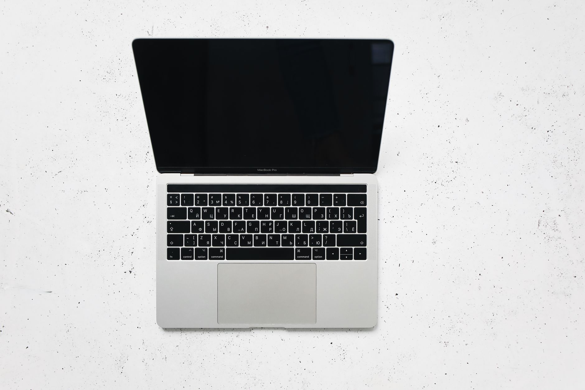
The camera housing at the top of a MacBook display sits in the middle of the menu bar, and there are two completely different reasons to want it gone. One is visual: the black cutout interrupts a wallpaper and looks wrong against a light image. The other is practical: menu bar icons that used to be there have stopped appearing, and the housing gets the blame.
These need different fixes, and applying the wrong one wastes an evening. Painting the top of the screen black makes the cutout invisible and does not return a single icon. Apple's own per app setting moves an app below the camera and has no effect on the menu bar in normal use. The section that matters depends on which of the two is the actual complaint, so it is worth naming that first.
Which MacBooks have it
The housing is built into the display bezel on the 14 inch and 16 inch MacBook Pro from the 2021 generation onward, and on the MacBook Air with an M2 chip and later, in both the 13 inch and 15 inch sizes. Apple describes these as a MacBook Air with Liquid Retina display or a MacBook Pro with Liquid Retina XDR display. Earlier machines have a bezel instead and none of what follows applies to them.
On an external display there is no housing at all, which is worth remembering when a problem only appears on the laptop screen. If icons are missing on the built in display and present on the monitor, the cause is space, and the housing is consuming a chunk of it.
Making the cutout invisible
The visual fix is simple and entirely cosmetic: make the area around the housing black, so the cutout stops being distinguishable from the strip it sits in. There are two ways to do it.
The manual way is a wallpaper with a black band across the top. The band needs to be at least as tall as the menu bar, and on a scaled resolution the pixel height is not the obvious number, which is why hand made versions often leave a visible seam. It costs nothing and it breaks as soon as the wallpaper changes.
The automated way is a small utility that does the same thing and keeps doing it. TopNotch is the best known, it is free, and it "requires macOS 11.0 or newer" according to its own site. It works across multiple displays and spaces, handles dynamic wallpapers, and can round the corners of the wallpaper to match the display. What it does not do, and does not claim to do, is change how much fits in the menu bar.
What the black strip costs
Very little, which is why it is popular. The trade is that the top of every wallpaper is now black, so photographs lose their top band. On a dark image nobody notices. On a bright landscape the crop is obvious. Anyone who chose their wallpaper deliberately should try it for a day before deciding it is free.
Apple's own setting, and what it is for
There is a built in control, and it is frequently recommended for the wrong problem. In the Finder, select an app in the Applications folder, choose File and then Get Info, or press Command-I, and look in the Info window for Scale to fit below built-in camera. The app has to be closed first.
Apple describes the effect precisely: it ensures "the menu bar and app windows appear below the built-in camera on your Mac and are always visible." The setting "adjusts the active area of your display" so that the app treats the region below the housing as the whole screen.
The situation it solves is an app whose own controls land behind the housing, which happens in full screen with software that draws its own title area or toolbar near the top. Turning the option on for that specific app fixes it.
The situation it does not solve is a crowded menu bar. Switching it on for an app does not create room in the bar, and it costs a strip of vertical screen space inside that app. It is a per app repair, not a system setting, and applying it to everything shrinks the usable display for no benefit.
The problem that actually hurts
The complaint worth taking seriously is icons that have stopped appearing. The important fact is that they are not hidden behind the housing. Since macOS 12.1, the system stops laying out menu bar items before it reaches the camera area rather than placing them underneath it. An item past the limit is not drawn at all.
That distinction changes what a fix has to do. Nothing that affects the appearance of the housing will help, because the missing items were never drawn there. The only thing that helps is reducing how much is competing for the space to the left of the housing, or collapsing it.
The behavior also explains a confusing symptom: the icon that disappears is not always the same one. Menu bar items are laid out in a fixed order, and whichever app happens to load last is the one that finds no room. Quitting an unrelated app can make a missing icon reappear, which makes the whole thing feel random when it is not.
How to confirm the diagnosis in thirty seconds
There is a quick test that settles which problem is in play, and it needs no software. Connect an external display, or start an app in full screen and then move the pointer to the top edge of the built in screen. If every expected icon is present in one of those situations and absent in the other, the cause is space, and the housing is taking a share of it. If the same icons are missing everywhere, the cause is an app that was quit, an item switched off in settings, or a permission an app is waiting on, and none of the advice about the housing applies.
The second half of the test is counting. Note how many items sit to the left of the housing on a normal day. Anything above roughly a dozen on a 14 inch screen means the bar is already at its limit and every new tool installed from now on will push something off the end. Knowing the number turns the problem from a recurring mystery into a budget.
| Approach | Fixes the cutout | Returns missing icons | Cost |
|---|---|---|---|
| Black top wallpaper or a utility that draws one | Yes | No | The top band of every wallpaper turns black |
| Scale to fit below built-in camera | No | No | Vertical screen space inside that one app |
| Moving system icons into Control Center | No | Yes, a few | Those items take one extra click |
| Show When Active instead of Always Show | No | Yes, a few | Status is no longer ambient |
| A menu bar organizer | No | Yes | One new gesture to learn |
Reducing what competes for the space
Work through this in order, because the free steps often finish the job on their own.
Start in System Settings, in the Menu Bar pane. The system controls are listed individually, and several of them offer a choice between Show When Active and Always Show. Wi-Fi, Bluetooth, Sound, Screen Mirroring and Focus are the usual candidates. Setting them to appear only when active can free several slots immediately, and the items remain available in Control Center.
Next, look at the list of apps allowed to place an item in the menu bar, on the same pane. Installed software accumulates there, and a certain number of entries belong to tools that are no longer used. Switching those off is free.
Third, consider display scaling. A scaled resolution with smaller interface elements fits more items before the housing, because each item takes fewer points. It is a real gain and it applies to everything on screen, so it is a preference rather than a fix.
If the bar still overflows after all three, the remainder is third party icons that each insist on being present, and macOS has no mechanism for collapsing them. That is the gap a menu bar organizer fills, and the specific thing to check is what happens after an icon is tucked away. A tool that hides an icon but cannot open its menu without expanding the whole bar has turned one problem into another. Comparing what each tool does once an icon is hidden separates them faster than comparing feature counts.
Where the free steps usually stop
The three steps above tend to recover between four and eight slots on a typical machine, and that is often the difference between a bar that overflows and one that does not. They also have a side effect worth naming. Once Wi-Fi, Bluetooth and Sound are set to appear only when active, the bar becomes inconsistent by design: it is shorter on a normal day and longer during a call or a file transfer. For some people that is a feature, because a visible icon now means something is happening. For others it is worse than a full bar, because the layout shifts under the pointer and the icon that was second from the left this morning is third now.
If that shifting is intolerable, the better answer is the opposite: keep everything set to Always Show so positions stay fixed, and collapse the ones that are rarely needed into a single place instead. Stability and brevity pull in different directions, and the housing forces a choice between them on a laptop screen in a way it never does on an external monitor.
A note on full screen
Full screen changes the picture in a way that is easy to miss. With the menu bar hidden, the housing area is simply part of the black surround, and the cutout stops being visible at all. Bringing the pointer to the top edge returns the bar, and the layout constraint returns with it.
This means that a machine used mostly in full screen has a cosmetic problem only intermittently, and a machine used mostly on the desktop has it constantly. It is worth checking which of the two describes actual daily use before installing anything, because for a lot of people the answer removes the cosmetic half of the question entirely.
What to change first
Decide which complaint is real. If the cutout is ugly, a black top wallpaper solves it in a minute and costs nothing. If icons have gone missing, ignore the cutout entirely and go to the Menu Bar pane in System Settings, switch the system controls you rarely watch to Show When Active, and turn off the app entries you no longer use. If the bar still overflows after that, the remaining icons need collapsing rather than hiding, and Koffret is one of the tools built for exactly that step.
Frequently asked questions
Can the notch be turned off completely on a MacBook?
No. The camera housing is physical and the display is built around it. What can be changed is whether it is visible, by making the area around it black so the cutout blends into the strip, and whether an individual app runs below it using the Scale to fit below built-in camera option in the Finder Info window.
Are menu bar icons hidden behind the notch?
Not since macOS 12.1. The system stops placing items before it reaches the camera area, so an item that does not fit is simply not drawn. That is why no cosmetic fix returns it, and why reducing the number of items in the bar is the only thing that works.
Does "Scale to fit below built-in camera" help with a crowded menu bar?
No. It changes the active display area for one specific app so that the app's own windows and controls sit below the camera. It does not create room in the menu bar, and it costs vertical space inside that app, so it should be applied only to apps whose controls actually land behind the housing.
Why does one icon disappear and come back at random?
The order of menu bar items is fixed, and the app that loads last is the one that finds no room. Quitting or launching an unrelated app changes which item falls off the end. It looks random from outside but the rule is consistent.
Does a black wallpaper strip affect anything besides looks?
No. It is an image change and nothing else. It does not free space, does not change how items are laid out, and has no effect on performance. Judge it purely on whether the black band spoils the wallpapers you actually use.