Mac Dark Mode: what happens to the menu bar and the icons in it
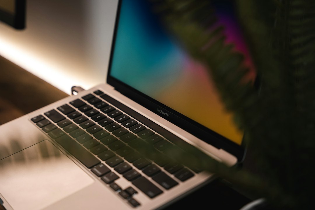
Turning on Dark Mode on a Mac takes one click, and most of the interface handles it well. Windows recede, documents come forward, and a room lit by one lamp stops being lit by the screen as well. The part that rarely looks finished is the strip along the top. Some status icons invert cleanly, some keep the colours they were drawn with, the privacy dots become harder to spot, and the bar as a whole somehow looks busier than it did an hour earlier in the light appearance.
None of that is a bug, and none of it is fixed by switching back. It follows from how the appearance setting works, what it reaches, and who draws the icons in the menu bar.
Where the setting lives and what it reaches
Appearance sits in System Settings, in the sidebar, and it may need scrolling to reach. It offers three choices. Light is a light appearance that does not change. Dark darkens the colour scheme so that the content being worked on stands out while windows and controls seem to recede into the background, which Apple describes as effective for documents, presentations, photos, films and webpages. Auto switches between the two during the day.
What Dark covers is specific: the menu bar, the Dock, windows and built-in apps. Third-party apps are invited rather than compelled. An app built with the standard system controls follows along without its developer doing anything; an app that draws its own interface, or that carries a theme setting of its own, does whatever it was told to do. This is why a Mac set to Dark can still contain one blazing white window, and why the fix for that window is in the app rather than in System Settings.
For a setting changed daily there is a faster route than the settings app. Clicking the Control Center icon in the menu bar, then the arrow next to Display, brings up a panel with Dark Mode in it. That is two clicks from anywhere, and it changes the same setting.
Auto, and the two rules behind it
Auto is not driven by a clock of its own. It switches the appearance from light to dark based on the Night Shift schedule that has been set, and when no schedule has been set, it falls back to sunrise and sunset times. So the schedule for warming the display colours is also the schedule for the interface, and editing one moves the other.
The second rule accounts for the complaint that Auto does not work. It will not switch the appearance until the Mac has been idle for at least a minute. A machine being typed on at the scheduled moment stays light until the first pause. Nothing needs restarting, and no permission is missing.
The rest of the Appearance pane
Appearance holds considerably more than three radio buttons, and several of the other controls change how the menu bar and the icons around it read.
Liquid Glass is a slider for the appearance of app icons, from clear at one end to the heaviest tinting at the other, with everything in between available. Colour sets the accent used for buttons, pop-up menus and other controls, and Text highlight colour sets the colour behind selected text.
Icon and widget style is the one with the most consequence. Default leaves items opaque, with a light or coloured background depending on the app. Dark makes them opaque and darkened, and offers Always to keep them that way or Auto to follow the system appearance. Clear makes them transparent, again with Light, Dark or Auto. Tinted makes them opaque against a dark background, with icons, text and graphics drawn in the colour chosen under theme. Depending on which of those is selected, the pane then offers Folder colour or a combined Icon, widget and folder colour control for Finder folder icons.
Sidebar icon size offers small, medium or large for the Finder sidebar and for sidebars in apps such as Mail, News and Photos, and the text in the sidebar scales with it. Tint window background with wallpaper colour lets colours from the wallpaper subtly tint areas such as toolbars and status bars. Show scroll bars decides whether scroll bars appear automatically based on the pointing device, only while scrolling, or at all times.
One more behaviour is worth knowing because it looks like a bug. Some dynamic wallpaper pictures provide still images so that the wallpaper does not distract from the light or dark appearance, and a Mac set up with the dark appearance gets a dark still image as its wallpaper. A wallpaper that stopped changing after a switch to Dark was not broken; it was replaced, and it can be changed back.
What actually happens to the menu bar
Two settings decide how the bar looks, and only one of them is in Appearance. The other is in Menu Bar settings, and it is called Show menu bar background. It chooses between showing the wallpaper behind the bar and showing the menu bar background as its own surface.
That combination produces four outcomes rather than two. With the menu bar background shown, Dark gives a genuinely dark strip and contrast is predictable. With the wallpaper showing through, the brightness of the bar is set by the top edge of the wallpaper image, so a photograph with a bright sky produces a pale bar on a Mac that is otherwise dark, and a dark image produces a bar so dark that low-contrast glyphs disappear into it. Anyone whose menu bar looks wrong in Dark Mode should check this setting before anything else.
Menu Bar settings also holds Automatically hide and show the menu bar, with four options: Always, On Desktop Only, In Full Screen Only, and Never. Hiding the bar removes the contrast question entirely for as long as the pointer stays away from the top of the screen, at the cost of a small movement every time a status icon needs reading.
Why individual icons look wrong
The icons in the right-hand part of the bar are status menus, and they are drawn by the apps that own them rather than by macOS. The appearance setting is passed to those apps; what they do with it is their decision.
An app that supplies a template image, a single-colour silhouette with transparency, gets the correct treatment automatically: dark glyph on a light bar, light glyph on a dark bar. An app that ships a fixed bitmap designed against a light bar keeps that bitmap, and it looks muddy or nearly invisible once the bar goes dark. An app that uses a full-colour logo keeps the full-colour logo, which was unobtrusive against light grey and becomes the brightest object on the screen against black. None of the three can be corrected from System Settings, and there is no global override.
The case that matters most is the privacy indicators. Apple places them to the right of Control Center: an orange dot means the microphone is in use, green means a camera is in use, purple means system audio is being recorded, and an arrow means location is in use. Only one indicator is shown at a time, so when both a microphone and a camera are active, only the green dot appears. Opening Control Center shows a field naming which apps are using the microphone, location, camera or system audio, and clicking it opens the privacy window.
A single small coloured dot, placed at the end of a long row of other small bright marks, on a black strip, is the hardest thing on the screen to notice. That is a poor outcome for the one indicator nobody should miss.
A quick way to sort the icons out
Since there is no global control, the only method is a pass through them one at a time. Three questions settle most cases. Does the app have an appearance or icon setting of its own, often described as monochrome, template or follow system? If so, that is the fix, and it is usually one checkbox. Does the icon report a changing value, such as a battery percentage, a queue length or a connection state? If it does, it earns its place regardless of how it looks. Does it exist only to open a menu that a keyboard shortcut or Spotlight could open instead? If so, its visual treatment stops mattering, because it does not need to be visible at all.
The same bar, a different width
The menu bar is not a fixed amount of room. A laptop screen and a large external display give the status area very different widths, and the icons that all fit on one will not all fit on the other. App menus are drawn first, from the left, and they take as much room as their titles need, so the space left for status items also changes with whichever app is in front. A configuration that looks tidy in a text editor on a monitor can silently lose three icons in a development tool on the built-in screen.
Silently is the operative word, and Dark Mode makes it worse rather than better. There is no marker where the status area was truncated, no overflow indicator, and nothing to suggest that something used to be there. On a light bar the missing icon at least leaves a gap the eye has seen before. On a dark bar, with high-contrast glyphs drawing attention to what is present, the absence of one is close to invisible. Anyone who docks and undocks a laptop through the day is changing the available width several times a day without being told what fell off the end.
Dark Mode makes the count visible
Here is the effect that surprises people. On a light bar, a row of grey glyphs reads as texture and the eye skims it. On a dark bar, each glyph becomes a bright mark on black, and the same number of icons suddenly reads as clutter. Nothing was added. The contrast simply went up, and so did the attention each icon demands.
macOS provides two gestures and one settings pane for this. Holding Command while dragging an icon rearranges it; holding Command while dragging it out of the bar removes it. In Menu Bar settings, the clock is always shown and has its own format options, Wi-Fi, Bluetooth, Spotlight, Siri, Time Machine, VPN and Weather are individual checkboxes, and Focus, Screen Mirroring, Display, Sound and Now Playing each offer Show When Active or Always Show. Setting those five to Show When Active is the highest-value change in the pane. Below them, an Allow in the Menu Bar section lists third-party apps that provide menu bar items. Control Center handles the rest: Edit Controls adds, removes, resizes and rearranges items, and control-clicking an item offers Copy to Menu Bar.
Those controls cover what Apple supplies. They do nothing about the sync clients, password managers, monitors and utilities that produce most of the crowding, and removing any of them means losing the icon entirely. A menu bar manager for macOS takes a different approach: the rarely read icons move behind a divider, the bar keeps the few that report something, and the hidden ones come back on demand rather than being deleted. The feature list covers how revealing works without the bar expanding, and how it compares sets out the differences between the available tools.
What to change first
Open Menu Bar settings and check Show menu bar background before anything else, because a pale wallpaper behind a dark interface explains most complaints about Dark Mode and the menu bar. Then reduce what sits in the status area, so the privacy dots are the brightest thing there. Koffret covers the third-party icons that Menu Bar settings does not reach.
Frequently asked questions
Can the menu bar be dark while the rest of the Mac stays light?
Not as a supported setting. The appearance choice covers the menu bar, the Dock, windows and built-in apps together. What can be changed independently is whether the bar shows the wallpaper behind it or its own background, in Menu Bar settings, which changes how light or dark the strip looks without changing anything else.
Why do some menu bar icons stay coloured in Dark Mode?
Because each app draws its own status icon. Apps that provide a single-colour template image are inverted automatically by macOS; apps that supply a full-colour logo or a fixed bitmap keep exactly what they shipped. There is no system setting that recolours them, so the only options are to change the setting inside that app, if it offers one, or to stop showing the icon.
Why does the appearance switch at the wrong time on Auto?
Auto takes its schedule from Night Shift. If no Night Shift schedule has been set, it uses sunrise and sunset instead, which will not match a time chosen by hand. It also waits until the Mac has been idle for at least a minute before switching, so active use delays it.
Does Dark Mode reduce eye strain or save battery?
On displays where individual pixels emit their own light, dark pixels draw less power, so there can be a battery benefit. Screen brightness remains a much larger factor than appearance for both power and comfort. Dark Mode is best treated as a way to stop a bright interface competing with the content, which is how Apple describes it.
Is there a keyboard shortcut for switching to Dark Mode?
There is no shortcut assigned by default. The quickest built-in route is the Control Center icon in the menu bar, then the arrow next to Display, then Dark Mode. A Shortcuts automation that sets the appearance can be given a keyboard trigger, which is how most people who switch several times a day end up doing it.